Showing posts with label pastel. Show all posts

Tuesday, March 13, 2012

Street Painting!

The masters are always popular at SPFs,
and this Mona Lisa reproduction was
beautifully executed.
I lived in Raleigh for about 12 years, and for three of those years I worked for Visual Art Exchange (a non-profit) and helped organize and produce the Raleigh Street Painting Festival (now part of SPARKcon), a public art festival during which artists (professionals, amateurs, and school groups) create large chalk pastel paintings on asphalt. In fact, I was at VAE in 2001, RCSP's first year. That festival grew from festivals here in Florida and, to be perfectly honest, putting together the festival was my favorite part of my job. It's an enormous undertaking, with planning for the next year beginning as soon as the current year's festival is over. I really miss that part of working with non-profits...it's so amazing to get involved with community. So when I discovered that I live about an hour south of the Lake Worth Street Painting Festival (their web site boasts they are the largest street painting fest in the WORLD), I was thrilled!

The LWSPF was a couple of weekends ago. I didn't have time to get my students involved this year, but next year I'll definitely be organizing some student teams. If you live anywhere near a street painting festival, I highly recommend spending a Saturday or Sunday purusing the art. I went on Sunday morning around 10am when I knew most of the artwork would be largely completed. There were still a number of artists at work, as well, so if you want to see the work in progress AND get a good taste of the finished product, Sunday morning is the time to go. (Most festivals are two days, beginning Saturday.)

Here are a few of my favorites from the 2012 Lake Worth Street Painting Festival. Visit their website to learn more about this beautiful tradition.


And a few student squares (Elem., MS, and HS):


Monday, March 12, 2012

Warm/Cool Landscapes

(Photo note: Can't quite get the contrast
right, so the color's a little off.)
Second grade students recently completed warm and cool color landscapes in oil pastel on black construction paper. I've seen this project on several blogs, but I really like the tutorial on Kids and Glitter's blog

My students really loved this project, and it made them feel so successful. The basic premise is pretty simple: Students create a landscape drawing with very clearly separated sky and land elements (hills, mountains, etc.) Students place warm colors only in the sky and cool colors only in the land, or they can choose the reverse. (My students and I decided that when the cool colors are in the sky it looked like night time.)

In addition to the tips on Kids and Glitter, I gave my students a large (12x18) sheet of newsprint to put beneath their black paper. For some students, the ability to visualize the concentric circles in the sky is really difficult. They want to connect the lines at the edge of the paper and have difficulty imagining that each circle just keeps going as though the paper continued, as well. I helped students solve this problem by having them continue the circles on their newsprint (so they could see the complete circles), which really clarified this step for them. For many, once they used the newsprint to draw the complete circle a couple of times, they understood what was happening and were able to finish their drawing only on the construction paper.

The results are very dynamic (as long as students press firmly and don't leave a lot of black construction paper showing through the pastel). The other examples of this project that I've seen use black pastel to trace the lines in the drawing, but I gave students a choice. Most of them chose to leave the lines untraced for a softer look. Many also wanted to add snow caps to their mountains. Nice.


Wednesday, March 7, 2012

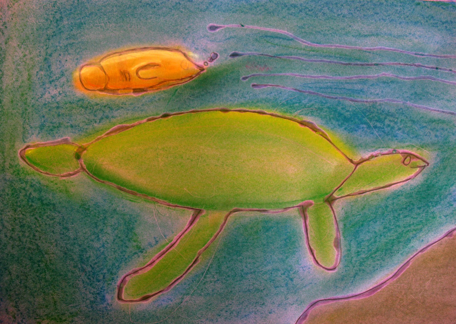
Endangered Species

This lesson was inspired by my fellow art teacher last year. I can't remember the web site from which he printed the animal photos (if I find it I'll post the link), but students chose an endangered animal to draw, working from the photos (simple lines, not a lot of detail...we talked a lot about simplifying).

After working out composition, students drew their chosen animal on a sheet of 12x18 colored construction paper. They then traced their lines in glue. The clear, dry glue allowed the construction paper color to show through as the line color. Students then used chalk pastels to add color to their drawing.

Love messy hands!
The big ideas of this project were color and composition. Simplifying the lines of the drawings was an excellent exercise for students, as well, since young artists often get "blocked" when faced with too much detail (where to begin??). So we broke the background information down into basic shapes and spaces. Also, too much detail and the glue lines run together creating puddles, so simplifying was of practical importance, as well. Another benefit was that simplification often led to abstraction, which brought the animal into greater focus.

Here are a few of the finished drawings:


Saturday, February 19, 2011

Winter Oil Pastels (3rd-5th)

Broward Education Foundation held a holiday card contest in November, so I took the opportunity to introduce students to oil pastels and the beautiful contrast that can be achieved by applying them to black construction paper. One of our entries won third place in the elementary division!

I do get frustrated with the number of contests that are pushed our way, and as often as I can I try to turn the contests into lessons. Aside from being a terrific introduction to oil pastels, our card designs offered excellent opportunities to discuss contrast, composition, horizon line, foreground/background/middle ground, shape, positive/negative space, and texture. Students were encouraged to let the black of the construction paper become part of their art by allowing it to show through in lines and other areas of black.

Below are just a few of our submissions. (I apologize for the quality of the images. I didn't have time to scan these before submitting them, and the only camera I had was my phone. Where I've been able to remember which students made a drawing, I've added first names.) 

Artist: Midsi, 3rd Place Winner - Broward Education Foundation Holiday Card Contest

Artist: Declan


(Seriously...what's more fun than snowboarding penguins??)


Artist: Joseph


Aritst: Evangelina


Artist: Miquel