Tuesday, March 13, 2012

IF: YIELD

I've viewed a lot of IF submissions this week, and I've been surprised (and a bit comforted) by how many folks noted that this week's topic, Yield, was a tough one for them. It was for me, as well. I think this is because the word "yield" has very concrete meanings for me, so it was a bit more difficult to try to break out of the road sign and garden references (though I did see some extremely creative and well-done illustrations along these themes!).

So here's what I was thinking when I drew this bright bird (and I know...it's quite a stretch): Just how bizarre/colorful/odd would a bird have to be to yield Easter eggs? (Assuming, of course, that Peter Cottontail didn't have to color them all prior to delivery.)


Easter is one of my favorite times of year, so I've got colored eggs on the brain. Anyhow, I'm not crazy about the final outcome, primarily because it feels like the bird's colors are overworked. I like to leave more white when I use watercolors. But overall, I suppose he's not so bad for Day 4 of Spring Break AND the dreaded FLU (darn those adorable children). (So we could also say that 2 days of fever and chills followed by 2 days of pressure headache and congestion yields drawings of strange birds.)

Thanks for stopping by! Happy Spring! :)

Street Painting!

The masters are always popular at SPFs,
and this Mona Lisa reproduction was
beautifully executed.
I lived in Raleigh for about 12 years, and for three of those years I worked for Visual Art Exchange (a non-profit) and helped organize and produce the Raleigh Street Painting Festival (now part of SPARKcon), a public art festival during which artists (professionals, amateurs, and school groups) create large chalk pastel paintings on asphalt. In fact, I was at VAE in 2001, RCSP's first year. That festival grew from festivals here in Florida and, to be perfectly honest, putting together the festival was my favorite part of my job. It's an enormous undertaking, with planning for the next year beginning as soon as the current year's festival is over. I really miss that part of working with non-profits...it's so amazing to get involved with community. So when I discovered that I live about an hour south of the Lake Worth Street Painting Festival (their web site boasts they are the largest street painting fest in the WORLD), I was thrilled!

The LWSPF was a couple of weekends ago. I didn't have time to get my students involved this year, but next year I'll definitely be organizing some student teams. If you live anywhere near a street painting festival, I highly recommend spending a Saturday or Sunday purusing the art. I went on Sunday morning around 10am when I knew most of the artwork would be largely completed. There were still a number of artists at work, as well, so if you want to see the work in progress AND get a good taste of the finished product, Sunday morning is the time to go. (Most festivals are two days, beginning Saturday.)

Here are a few of my favorites from the 2012 Lake Worth Street Painting Festival. Visit their website to learn more about this beautiful tradition.


And a few student squares (Elem., MS, and HS):


6th Grade Self-Portraits (a learning experience)

This is only my 2nd year of teaching Art in public/charter schools, so I'm still experimenting with a lot of techniques and media. I've been wanting to try oil pastel batik with a class, and since my 6th grade classes are the only ones for which I have sink access (I use a science classroom), I thought this would be a good place to experiment. So glad I've been telling my kids all year that art is an experiment and a terrific forum through which to practice our problem-solving skills!

Demo: Aside from a few gray lines where
the ink hadn't dried completely on the
paper, it worked just fine...
My demo turned out exactly as planned. I created the line drawing with white chalk pastel, then filled the image with oil pastel, laying it down heavily and leaving the white chalk lines visible. I then painted black India ink over the entire image, waited for it to dry (about 25 min), and rinsed it in the sink in my office. It came out GREAT, and I was so excited to do this with my students.


So I went through the process with my 6th graders...they spent a lot of time on their under-drawings, pressing firmly, leaving chalk lines empty. They really did a fantastic job. Only when we inked the drawings and began washing them, the ink didn't come off like it did with my demo. I'm perplexed. The first few students who began rinsing their drawings were washing away the oil pastel, as well, in trying to get the ink off, and one ended up with a small hole. So...I put a pause on the project until we get back from Spring Break. My only solution for salvaging these (the kids have put SO much effort into them) is to turn them into scratch board drawings. One student has already started on this process, and while the result is a bit "dirtier" than we were going for, it's not such a bad solution. I think we'll be touching them up with more oil pastels, as well, particularly the eyes and other focal points.

Student self-portrait w/
scratchboard technique begun.
I report when we're done. (View the updated post here!) In the mean time, if this has happened to anyone else, I'm open to additional ideas. I've read that some people add dish soap to the ink (which I didn't do), so perhaps that's part of the problem? Also, some of the kids inked theirs in one class, then washed at the start of the next, a space of two days wait time. I thought that might be the problem, so I had a couple of students ink theirs while we had time to wait for them to dry (again, about 20-25 min), but that persistent ink wouldn't come off of theirs either. So we just decided to let them dry again and wait to try the scratchboard technique. Aside from drying time with the first set of student work, there's absolutely no difference in materials or technique from the demo I made and the students' work. Ah well...mistakes are the foundation for discovery. We'll work it out. :)

Self-Portraits Everywhere!

We're buried in self-portraits at school! I feel like SPs are an annual experiment, and I'm always trying to find new media and inspiration for these. I'm working on Lichtenstein self-portraits with 5th grade right now, and 4th graders are doing an identity project with their self-portraits. I'll post those at the end of the month when they're complete. I'm trying to muster up the strength to do a collage SP project with 3rd grade in April (just thinking about carting around all the materials is giving me a headache). And this year's K and 1st grade splatter self-portraits are here
For now, here are a few of this year's 2nd grade self-portraits. As I usually do with 2nd, we discussed van Gogh and viewed a few of his self-portraits. We also talked about impasto and his use of color in all of his work. As with last year's 2nd grade paintings, we used oil pastels and tempera cakes, but this time we just created background textures (impasto style) with lines and dots, sticking with one color scheme for the background: warm, cool, analogous, primary, secondary, or complementary. Last year's 1st and 2nd grade Expressionist self-portraits can be viewed here.


Monday, March 12, 2012

Warm/Cool Landscapes

(Photo note: Can't quite get the contrast
right, so the color's a little off.)
Second grade students recently completed warm and cool color landscapes in oil pastel on black construction paper. I've seen this project on several blogs, but I really like the tutorial on Kids and Glitter's blog

My students really loved this project, and it made them feel so successful. The basic premise is pretty simple: Students create a landscape drawing with very clearly separated sky and land elements (hills, mountains, etc.) Students place warm colors only in the sky and cool colors only in the land, or they can choose the reverse. (My students and I decided that when the cool colors are in the sky it looked like night time.)

In addition to the tips on Kids and Glitter, I gave my students a large (12x18) sheet of newsprint to put beneath their black paper. For some students, the ability to visualize the concentric circles in the sky is really difficult. They want to connect the lines at the edge of the paper and have difficulty imagining that each circle just keeps going as though the paper continued, as well. I helped students solve this problem by having them continue the circles on their newsprint (so they could see the complete circles), which really clarified this step for them. For many, once they used the newsprint to draw the complete circle a couple of times, they understood what was happening and were able to finish their drawing only on the construction paper.

The results are very dynamic (as long as students press firmly and don't leave a lot of black construction paper showing through the pastel). The other examples of this project that I've seen use black pastel to trace the lines in the drawing, but I gave students a choice. Most of them chose to leave the lines untraced for a softer look. Many also wanted to add snow caps to their mountains. Nice.


Thursday, March 8, 2012

Printmaking Test

"Inked" plate ready to go...
I've just started a printmaking project with 2nd grade, using foam printing plates from School Specialty. With Spring Break just a day away, our minds are on the beach, so our theme is folk art beach houses. I stayed after a bit today to do a few test prints, and WOW, I'm so excited to share this process with the kids!

I've used markers to ink plates before, but I just got a set of Mr. Sketch watercolor markers. And after all the great things I've read about them, I couldn't wait to try them out. They work beautifully for inking foam plates! The trick is that you have to print on damp paper (NOT wet...see below). It took me a few attempts to figure out exactly how damp the paper should be to yield successful results. (Note: Lay printing plate flat and lay damp paper on top of plate, pressing gently all over without moving the paper.)

Here are a few photos showing my experiments with various degrees of wet/damp paper.

Print #1: On dry paper, just for comparison.

Print #1: I dipped the paper in the sink, let it drip
a bit, laid it on newspaper to soak up a bit of water,
then laid it on the plate. Didn't work so well.

Print #3: I laid dry paper on the inked plate, then
sprayed water on the paper. Again, not so good.
Print #4: Woohoo! Success!! I dipped the paper in
the sink, then pressed it between newspaper until it
no longer dripped. Then I laid the damp paper on
top of the inked plate, pressed gently to transer the
image, and lifted the print.
Note: I just checked the print, and as I've been typing the edges of some colors have bled just a tad. I'm thinking maybe I'll do one more test (tomorrow...time to go home!) with paper that is just a bit more dry. I think I'll bring in a couple of towels tomorrow and see if that helps. I'll add an update after the adjustments are made.

Wednesday, March 7, 2012

Endangered Species

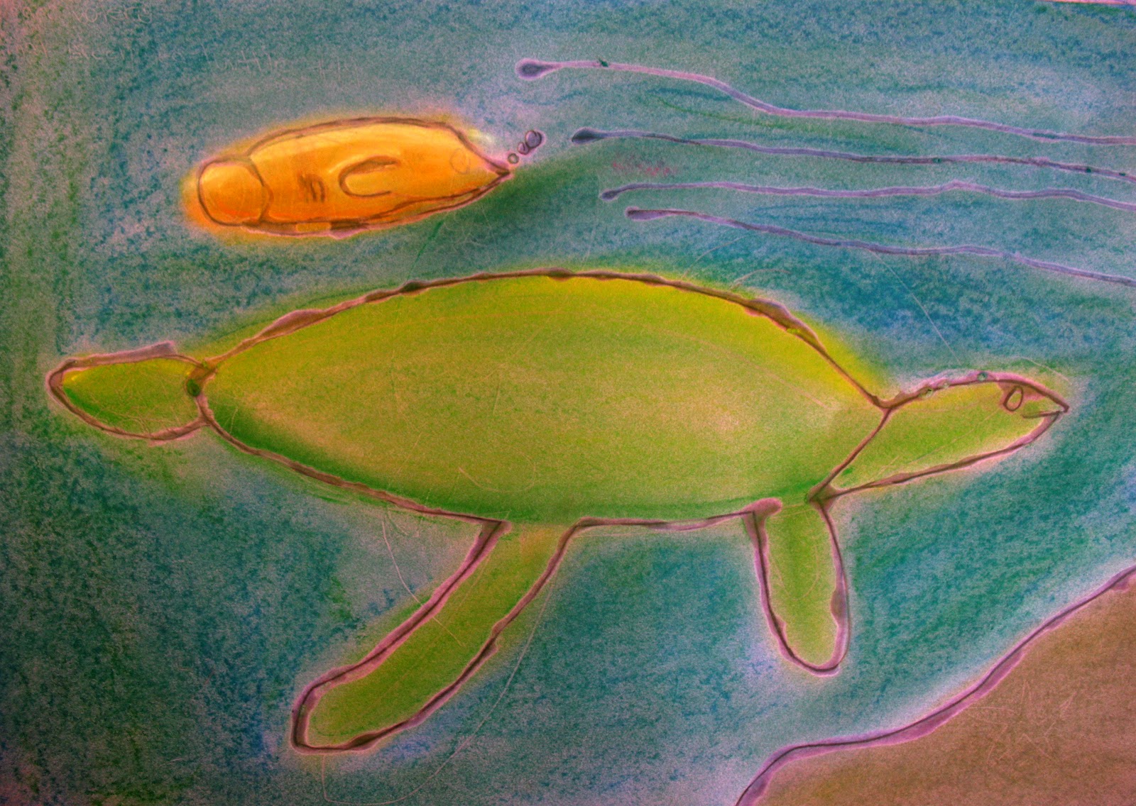
This lesson was inspired by my fellow art teacher last year. I can't remember the web site from which he printed the animal photos (if I find it I'll post the link), but students chose an endangered animal to draw, working from the photos (simple lines, not a lot of detail...we talked a lot about simplifying).

After working out composition, students drew their chosen animal on a sheet of 12x18 colored construction paper. They then traced their lines in glue. The clear, dry glue allowed the construction paper color to show through as the line color. Students then used chalk pastels to add color to their drawing.

Love messy hands!
The big ideas of this project were color and composition. Simplifying the lines of the drawings was an excellent exercise for students, as well, since young artists often get "blocked" when faced with too much detail (where to begin??). So we broke the background information down into basic shapes and spaces. Also, too much detail and the glue lines run together creating puddles, so simplifying was of practical importance, as well. Another benefit was that simplification often led to abstraction, which brought the animal into greater focus.

Here are a few of the finished drawings: