 |
| Demo: Aside from a few gray lines where the ink hadn't dried completely on the paper, it worked just fine... |
 |
| Student self-portrait w/ scratchboard technique begun. |
|
| Demo: Aside from a few gray lines where the ink hadn't dried completely on the paper, it worked just fine... |
|
| Student self-portrait w/ scratchboard technique begun. |
 We're buried in self-portraits at school! I feel like SPs are an annual experiment, and I'm always trying to find new media and inspiration for these. I'm working on Lichtenstein self-portraits with 5th grade right now, and 4th graders are doing an identity project with their self-portraits. I'll post those at the end of the month when they're complete. I'm trying to muster up the strength to do a collage SP project with 3rd grade in April (just thinking about carting around all the materials is giving me a headache). And this year's K and 1st grade splatter self-portraits are here.


 |
| (Photo note: Can't quite get the contrast right, so the color's a little off.) |
 In addition to the tips on Kids and Glitter, I gave my students a large (12x18) sheet of newsprint to put beneath their black paper. For some students, the ability to visualize the concentric circles in the sky is really difficult. They want to connect the lines at the edge of the paper and have difficulty imagining that each circle just keeps going as though the paper continued, as well. I helped students solve this problem by having them continue the circles on their newsprint (so they could see the complete circles), which really clarified this step for them. For many, once they used the newsprint to draw the complete circle a couple of times, they understood what was happening and were able to finish their drawing only on the construction paper.

 |
| "Inked" plate ready to go... |
 |
| Print #1: On dry paper, just for comparison. |
 |
| Print #1: I dipped the paper in the sink, let it drip a bit, laid it on newspaper to soak up a bit of water, then laid it on the plate. Didn't work so well. |
 |
| Print #3: I laid dry paper on the inked plate, then sprayed water on the paper. Again, not so good. |
 |
| Print #4: Woohoo! Success!! I dipped the paper in the sink, then pressed it between newspaper until it no longer dripped. Then I laid the damp paper on top of the inked plate, pressed gently to transer the image, and lifted the print. |
 This lesson was inspired by my fellow art teacher last year. I can't remember the web site from which he printed the animal photos (if I find it I'll post the link), but students chose an endangered animal to draw, working from the photos (simple lines, not a lot of detail...we talked a lot about simplifying).
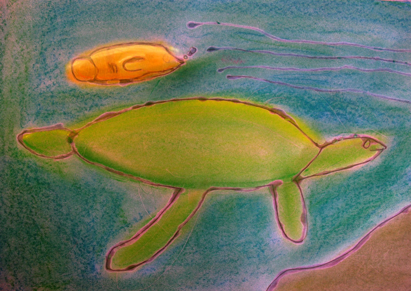
  After working out composition, students drew their chosen animal on a sheet of 12x18 colored construction paper. They then traced their lines in glue. The clear, dry glue allowed the construction paper color to show through as the line color. Students then used chalk pastels to add color to their drawing.
 |
| Love messy hands! |



 Because I'm very linear myself as an artist, it's tricky for me sometimes to break free of lines and take students on a more abstract journey. I'm trying though! This project inspired by Peter H. Reynolds' The Dot was quite a departure for me, and I loved it. The kids really enjoyed it, too, because there absolutely was NO wrong way to do this. (Not that there's ever a wrong way to make art, but kids are tough on themselves, even the little ones.) It was wonderful to be able to help them turn a "mistake" into a beautiful part of their art. (Don't like that red dot? Add yellow! Make it bigger! Outline it with purple! Endless possibilities!)
 I read The Dot to students, then gave them oil pastels and a piece of drawing paper and turned them loose. The only direction I gave them was to fill their paper with dots...big ones, small ones...dots everywhere! The next week we painted. Again, anything went, though I did keep an eye out for muddy colors. As I always do when I paint from the cart, I had a parent volunteer, so an extra pair of adult eyes watching out for over-saturated paper or too-thick paint was very very helpful.


 This started out as a basic self-portrait project. While talking about facial proportion, Kindergarten and 1st grade students drew themselves during a guided lesson. They then colored with crayon and cut out their self-portraits, and glued these to construction paper in a color of their choice. I encourage them to choose a contrasting color (so no pink if you colored your shirt pink, although it seems the young lady to the left slipped past me).


